
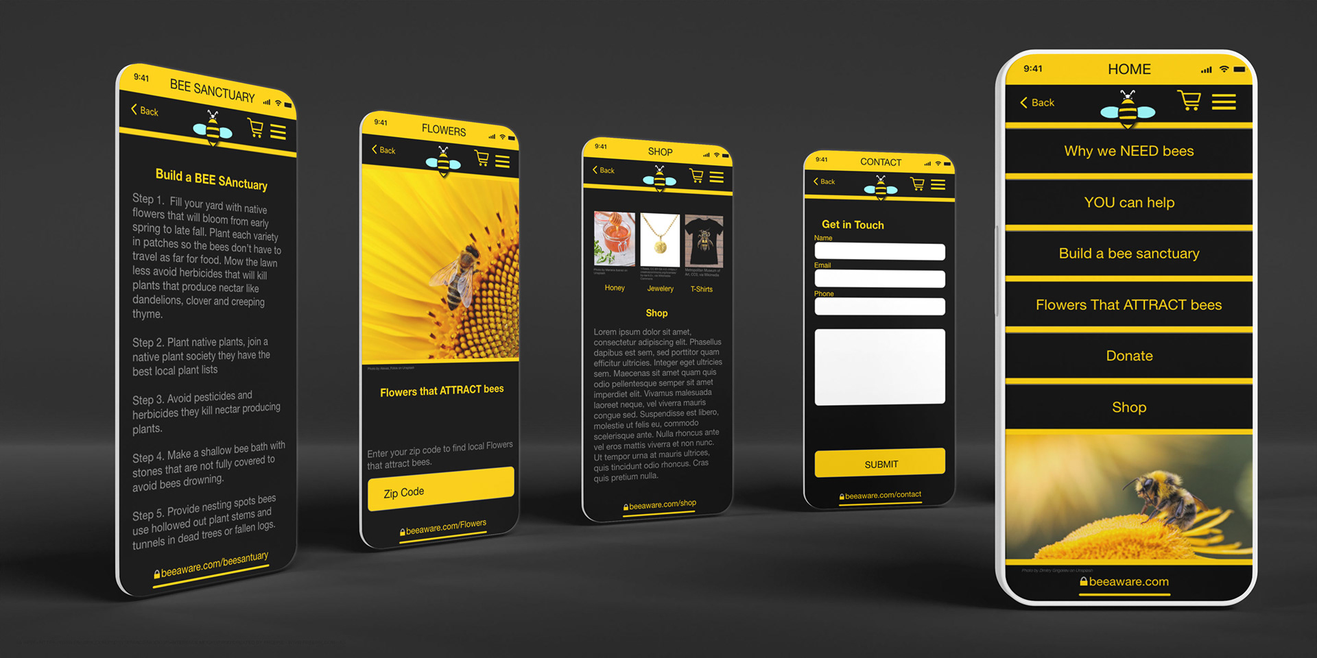
Photoshop mockup of Home, Contact, Shop, Flowers That Attract Bees, Bee Sanctuary pages
Introduction:
Justin is a dedicated father who wants to teach his children about Bee Conservation. He searched the web and App stores for an easy way to learn more about bee conservation. He is surprised to find several sites that discuss bee conservation, but none listed all the ways he could help save the bees in one easy-to-use app or website.
Project duration:
January - July 2022
The problem:
1 In 3 bites of food are pollinated by bees, and bees have become endangered due to loss of habitat and pesticides. I was inspired to create this website and mobile app to help those concerned about bee conservation find easy ways to help save bees.
The goal:
Create a dedicated mobile app and responsive website that will make it easy for Justin to find out what he can do to help save the bees.
My role:
UX designer: Lead the app and responsive website design from conception to delivery.
My Responsibilities:
Conduct interviews, paper and digital wireframing, low and high fidelity prototyping, conducting usability studies, accounting for accessibility, iterating on designs, determining information architecture, and responsive design.
Why was design involved:
Bees are an integral part of our environment; without bees pollinating our food, our food supply could become endangered. If we do something to help preserve bee habitats now, we can prevent bees from becoming extinct and conserve our food supply. Understanding the needs of people like Justin who are concerned about bee conservation helps me to create an easy-to-use dedicated mobile app and responsive website that will make it easy to find out what you can do to help save the bees.
Understanding the user:
I created two personas, Petra and Justin, to guide me through the design process.
Personas:
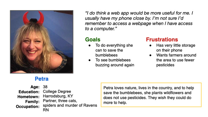
User persona Petra
Problem statement:
Petra is a busy RN who needs an app that will give her insights on what she can do to save the bees because she wants to do all she can to save the bees.
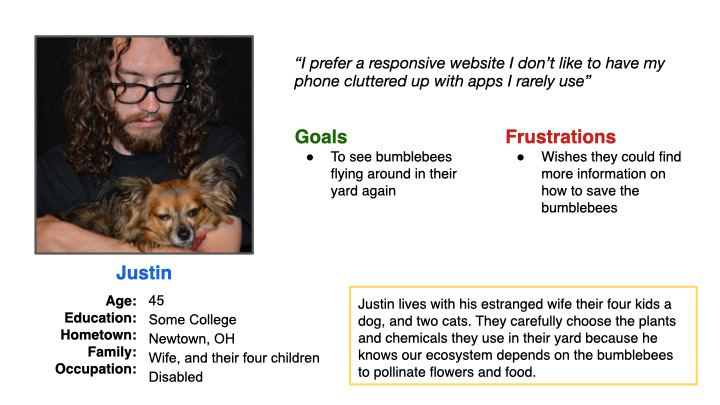
User persona Justin
Problem statement:
Justin is a dedicated father who needs a quick, easy way to find out if he is doing everything he can to save the bees because he has kids to wrangle and needs to find the information as quickly as possible.
Competitive Audit:
In my competitive audit, I found several Bee conservation sites on the web, but none listed all the ways people could help save the bees in one easy-to-use app or website.
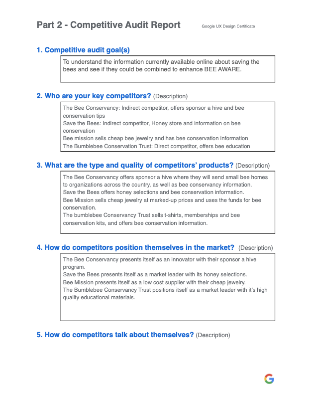
Competitive Audit Report
Ideation:
I did a quick ideation exercise for ideas on how to address gaps identified in the competitive audit. Specifically, on how to create a bee sanctuary, I found that a list of steps worked best.
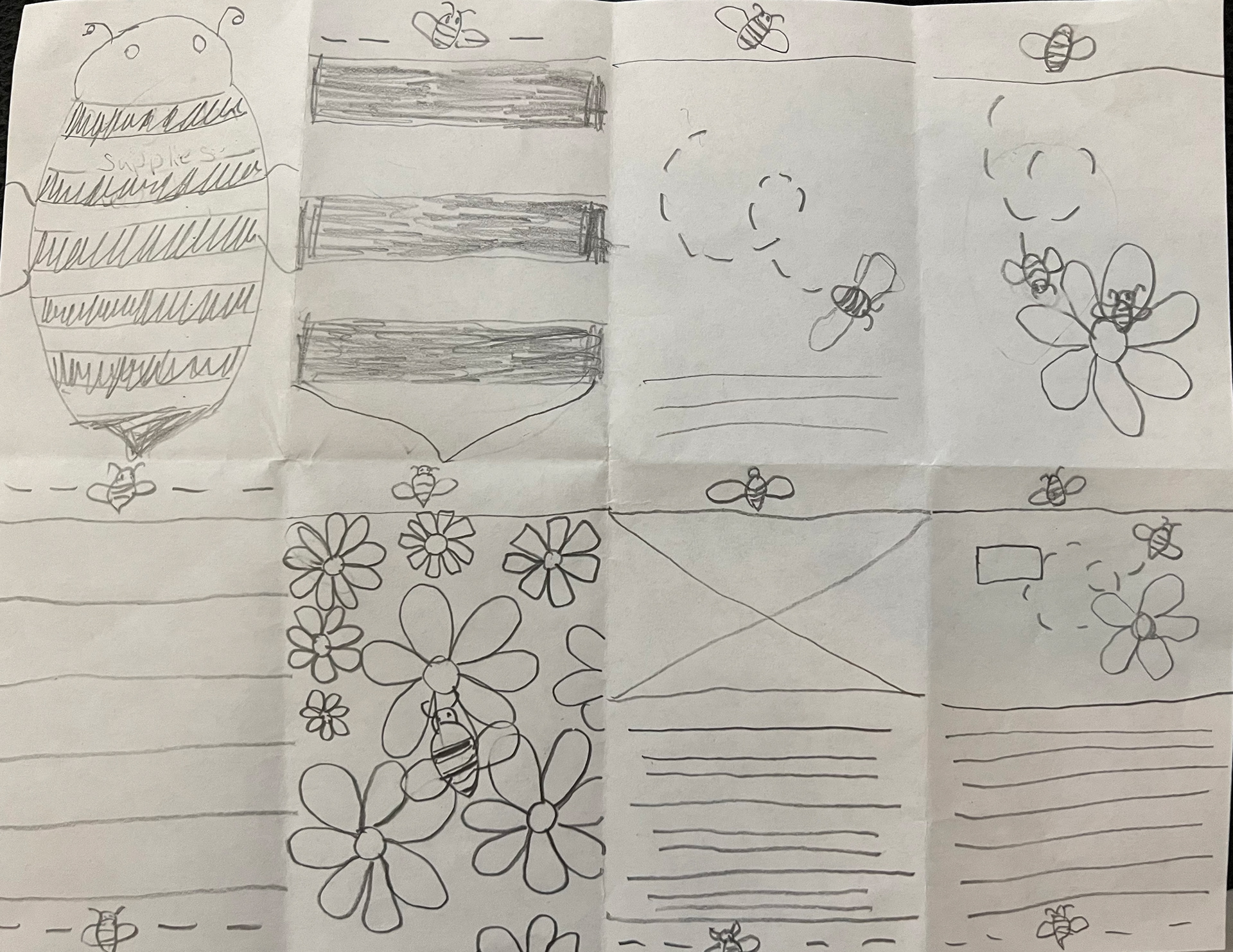
Initial sketches
Starting the design:
After sketching paper wireframes, I moved into Adobe XD and began designing my digital wireframes and low-fidelity prototypes. My goal was the ease of use; I found in my research that my user flow was confusing. Feedback from users helped make it more user-friendly.
I changed the page title from What YOU Can Do to a clear You Can Help.
I Moved the Build a Bee Sanctuary above Flowers That Attract Bees for a clear user flow.
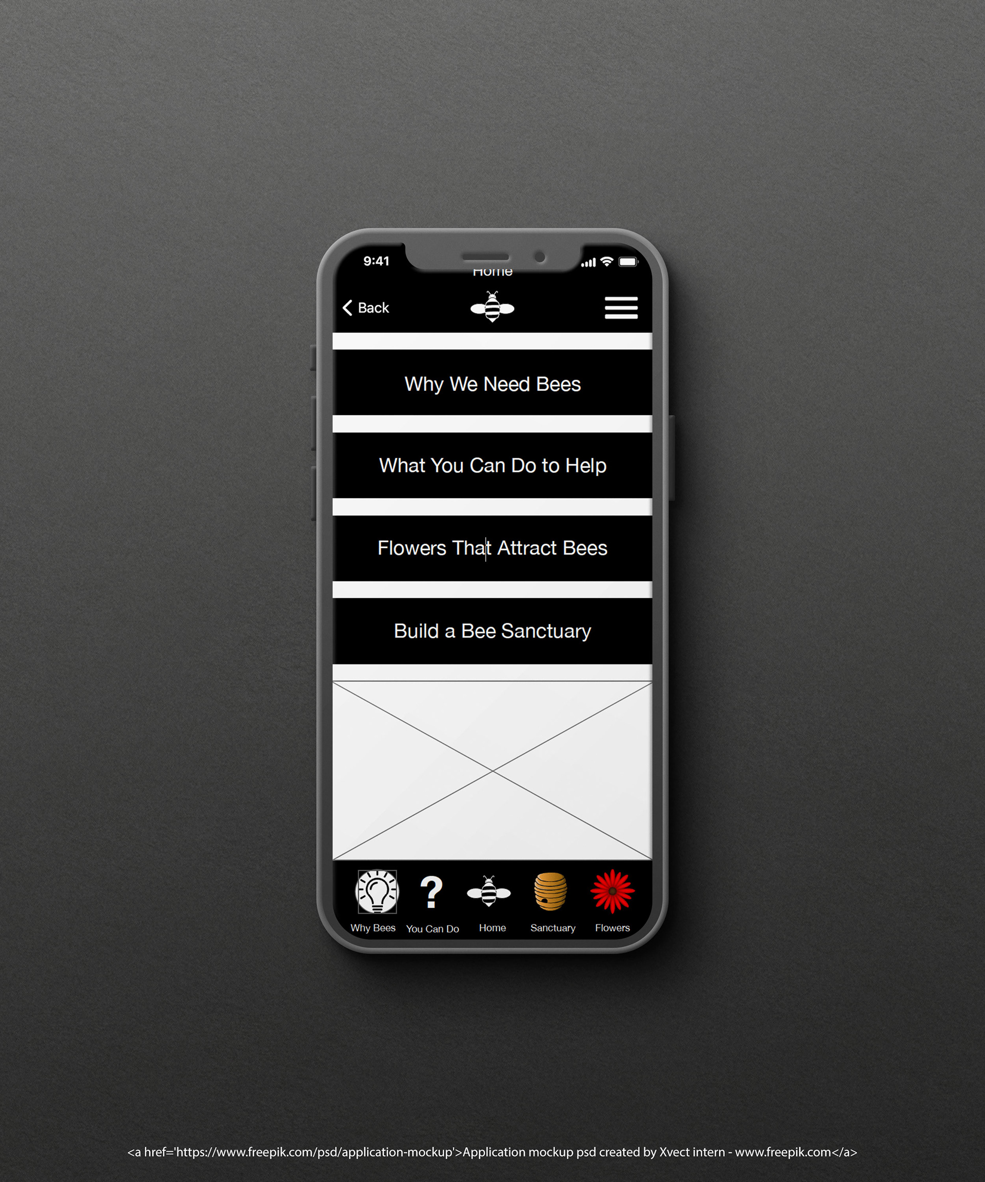
Digital mockup of Home page
Tone Spectrum
Scenario=User wants to know what they can do to help save the bees.
User Feels= Excited, a little overwhelmed
My goal for the user=To help them quickly find out what they can do to help
Tone=Friendly, helpful, clear
Message= You can help
Low-fidelity prototype:
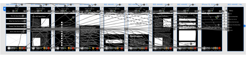
Low-fi prototype with connections
In the low-fidelity prototype, users were confused about What You Can Do and Build a Bee Sanctuary; I found switching their location and changing the wording made things less confusing.
Link to low-fidelity prototype:
Usability study: parameters
Study type:
I conducted two moderated usability studies, one on the low-fidelity design and the second on the high-fidelity design.
Location:
Covington, Kentucky
Participants:
Five participants, three with low vision.
Length:
15 minutes
I conducted two moderated usability studies at my home in Covington, Kentucky. I assumed the app was easy to use. I discovered it was confusing, inconsistent, and hard to navigate. Feedback received through research showed that users would be willing to work towards saving bees if they had access to an easy-to-use tool that would guide them through the process.
Refining the design:
Based on the insights from usability studies. The user flow was confusing; I needed to change the wording and location of the links to clear things up. Additional user research found that pricing was inconsistent; I added pricing to all detail screens.
Mockups:
Before the usability study After the usability study
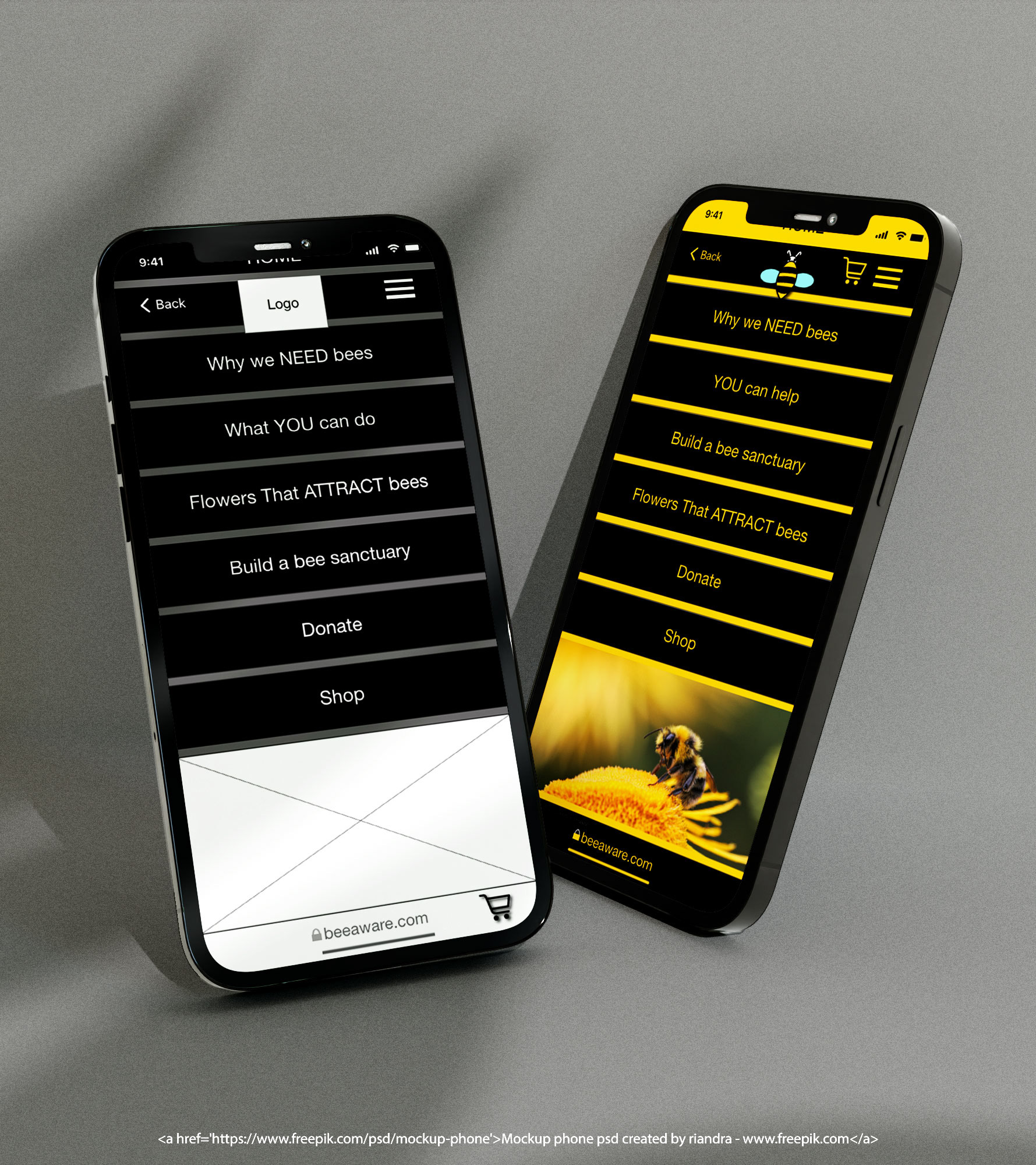
Digital mockup of home page before and after usability study
Before the usability study After the usability study
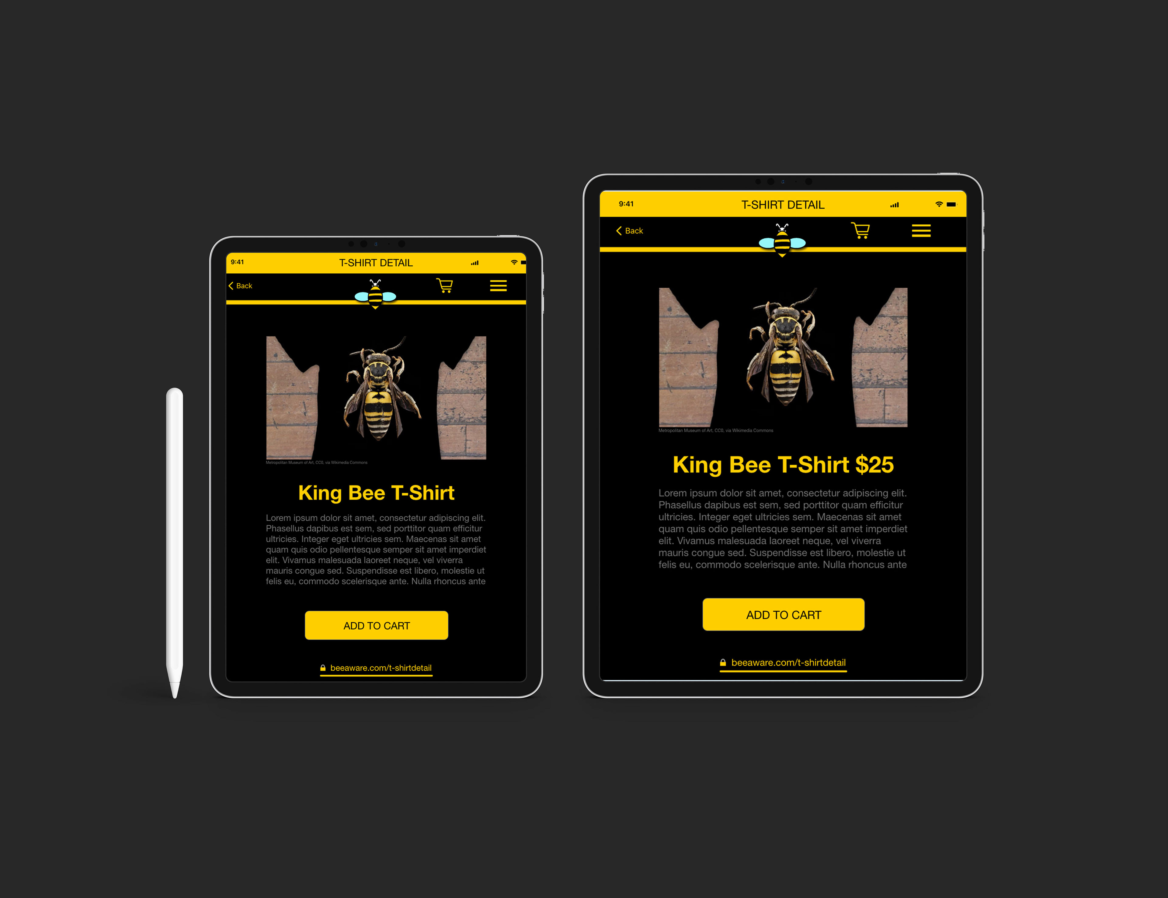
Digital mockup of T-shirt Detail page before and after usability study
High-fidelity prototype:
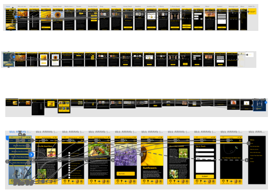
High-fidelity prototype of phone, tablet, desktop and mobile app
Links to High fidelity prototypes:
Desktop:
Tablet:
Mobile:
Mobile App:
Accessibility Considerations:
Low vision:
All type is 14 points or more, except for the image credits.
Low Vision and color blindness:
Contrasting colors are used throughout the design
Blindness:
Alt text is provided for all images.
Sitemap:
With app designs completed, I started work on designing the responsive website. I used the BEE AWARE sitemap to guide the organizational structure of each screen design to ensure a cohesive experience across devices.
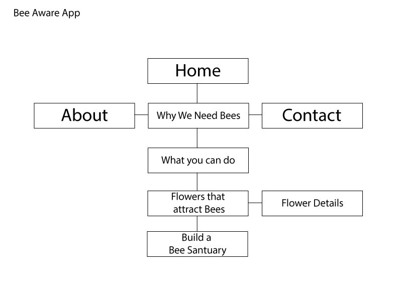
BEE AWARE sitemap
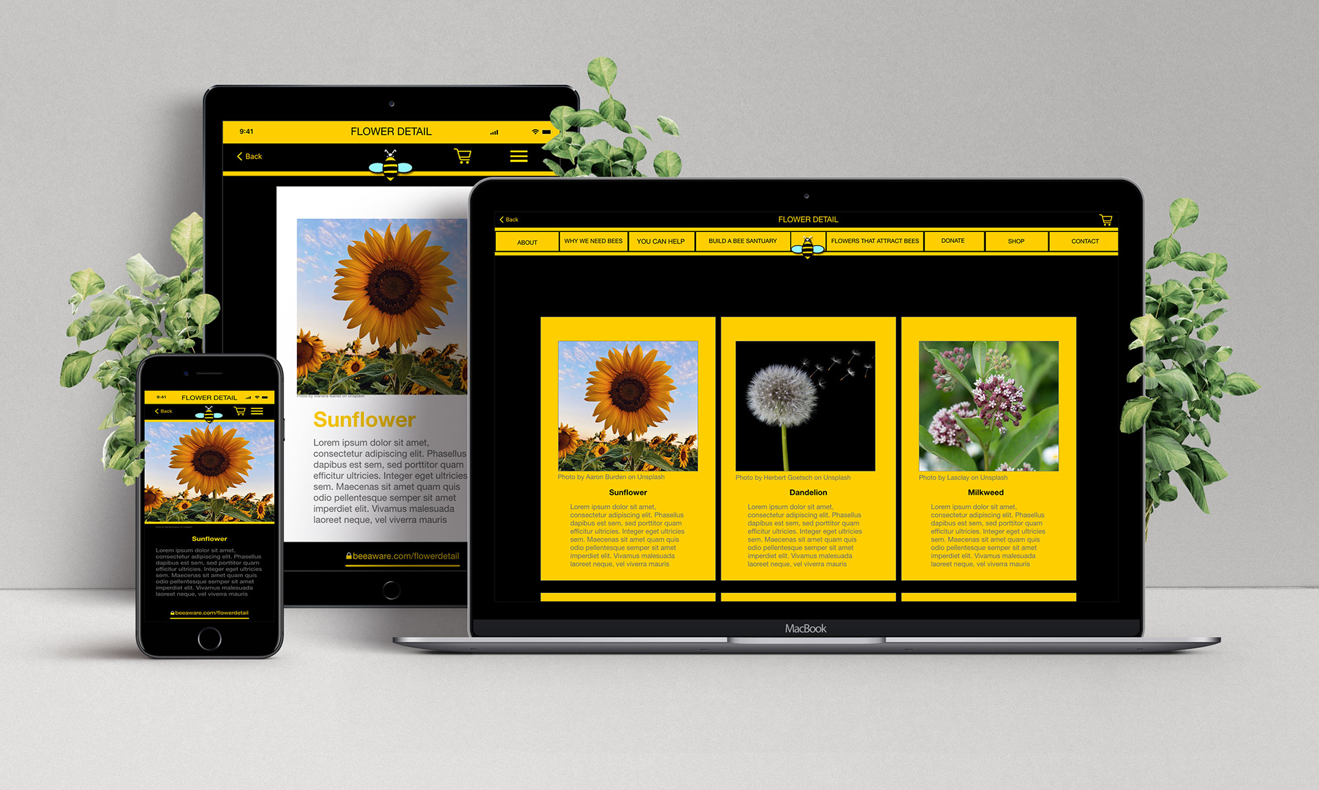
Responsive designs:
The responsive website and mobile app are simple to use and are an easy way for users can find ways to become involved in the bee conservation effort. It prevents bees from becoming extinct and strengthens our food supply.
Honey Detail Hi-fidelity mockup desktop
Takeaways:
Impact:
Users shared that the app made bee conservation something that they could easily do.
One quote from a user was:
“I believe in BEE AWARE; it’s pretty impressive and easy to follow.” ~Cristian Wolf
What I learned:
I learned what is clear to me is not necessarily easy for everyone. I needed to make the links on the home page clickable all around the words, rather than just making the words clickable. That the pricing was inconsistent, and the wording was confusing. I learned that attention to detail is paramount before testing.
Next Steps:
Add more educational resources for users to learn about bees and their conservation.
I am satisfied with how it turned out. I will show the app to a few Bee conservancy sites and see if they would be interested in using it.
If I find a site interested in my design, I would make any necessary changes and send it to the developers to code.
Thank you, For reviewing my BEE AWARE App and Responsive Website!